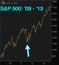
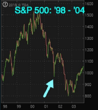
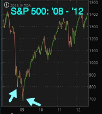
30-Year Historic Perspective
Historically Low Market “Internals” or “Breadth” Levels
There are many internal/breadth indicators. The most effective of which to identify long-term bottoms is the New York Stock Exchange Bullish Percent Index.
This measures the percent of stocks, listed in the NYSE, that are on buy signals. For example, when it’s at 44, that means 44% of stocks on the NYSE are on buy signals and the remaining 56% are on sell signals.
Because it shows the percentage, it oscillates between zero and 100.
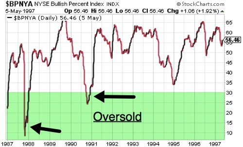
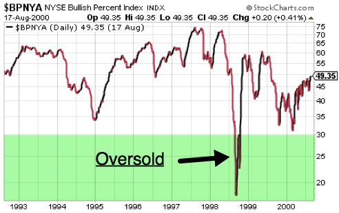
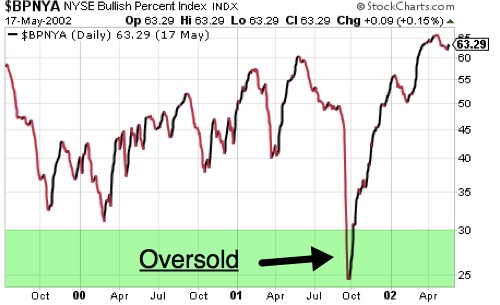
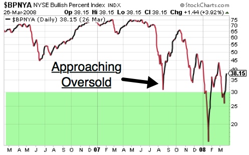
When the reading is below 30, markets are oversold and are most likely at or near a major bottom.
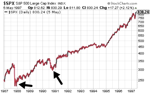
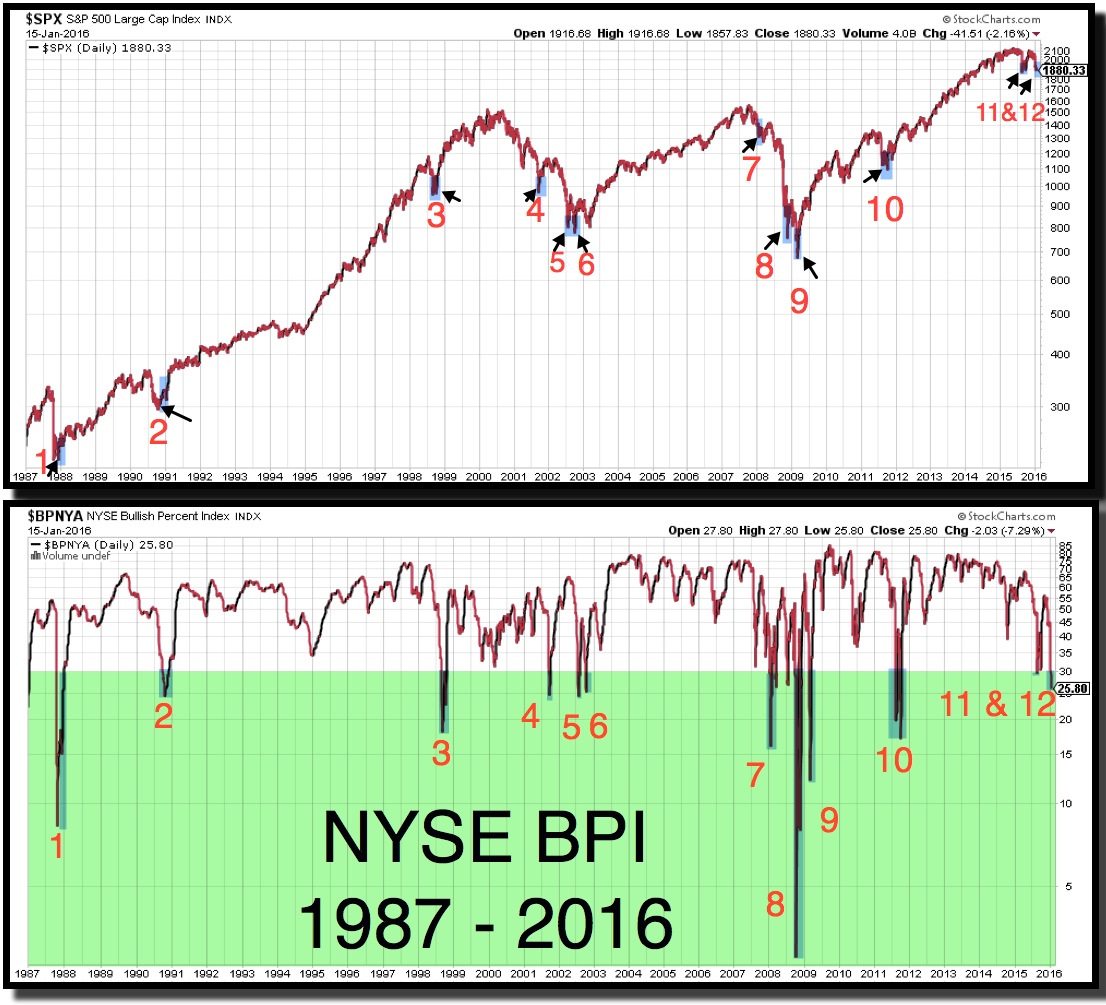
The chart, below, shows the S&P 500 (top) and NYSE BPI (bottom) going back to 1987.
Since keeping your emotions in check is so critically important in times like this, it may be very helpful to take some time to study the charts. Click on the image to enlarge it and compare the two charts.

I highlighted, in green, the area below 30, which is “oversold” territory. This is when most investors are making a very painful mistake and selling.
You can find the NYSE BPI at stockcharts.com using the ticker symbol $BPNYA.
But I’ll save you some work and list the dates, below, when the NYSE BPI was below 30 – in “oversold territory”.
- Oct 16, 1987 – Jan 5, 1988
- Sep 25, 1990 – Dec 3, 1990
- Aug 24, 1998 – Oct 14, 1998
- Sep 19, 2001 – Oct 3, 2001
- Jul 22, 2002 – Aug 7, 2002
- Oct 4, 2002 – Oct 16, 2002
- Jan 9, 2008 – Jan 31, 2008
- July 3, 2008 – July 16, 2008
- Sep 30, 2008 – October 30, 2008
- Nov 11, 2008 – December 4, 2008
- Feb 19, 2009 – Mar 17, 2009
- Aug 8, 2011 – Aug 29, 2011
- Sep 22, 2011 - Oct 11, 2011
- Aug 24, 2015 – Sep 10, 2015
So on average, the stock market stays in oversold territory for just over one month. Sometimes it’s just a couple of weeks. But the point is that there are few instances that you can find on the chart, above, when it would have been a good time to sell.
Even when the stock market was headed into a new bear market, in late 2007 – early 2008, it paid to await the next rally to exit your stock positions as opposed to selling at a low.
I created this video and launched this special NYSE BPI page that updates when there’s a significant change.
I will be hosting webinars for those viewers who would like to ask questions, live. Revisit this website to find invites to those future live webinars.
